A new-fashioned
Spielhalle
The goal was to create an identity including branding, art direction and styling for
desktop and mobile appearances.
Project
Role
Team
Ideation & Concept
Art Direction & Design
Prototyping w/ micro animations
Ivan Provenzale, Creative Director
Lu Yu, Senior Art Director
Kristina Wuerz, UX Copywriter
I created all brand parts focussing on a modern and playful design language and its core mission to communicate a simple way of online gaming.
Project
Hyperino
Role
Ideation & Concept
Art Direction & Design
Prototyping w/ micro Animations
Team
Ivan Provenzale, Creative Director
Lu Yu, Senior Art Director
Kristina Wuerz, UX Copywriter
Project
Hyperino
Role
Ideation & Concept
Art Direction & Design
Prototyping w/ micro Animations
Team
Ivan Provenzale, Creative Director
Lu Yu, Senior Art Director
Kristina Wuerz, UX Copywriter
The biggest challenge of this project was the subject matter. Online gambling is not exactly the most credible business in mind, not known for its brands. We had to find a way to create trust and transparency thru UX, key visuals and tone & voice.
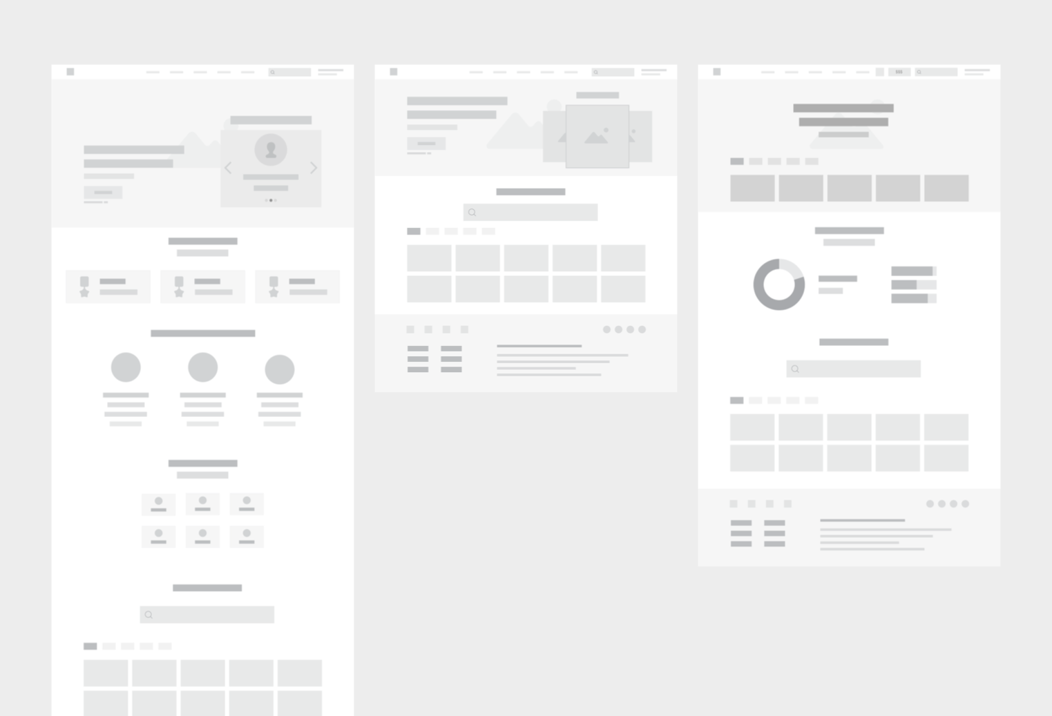
Desktop wireframes. Left to right:
For new users, returning
users or signed-in users.
Process and outcome
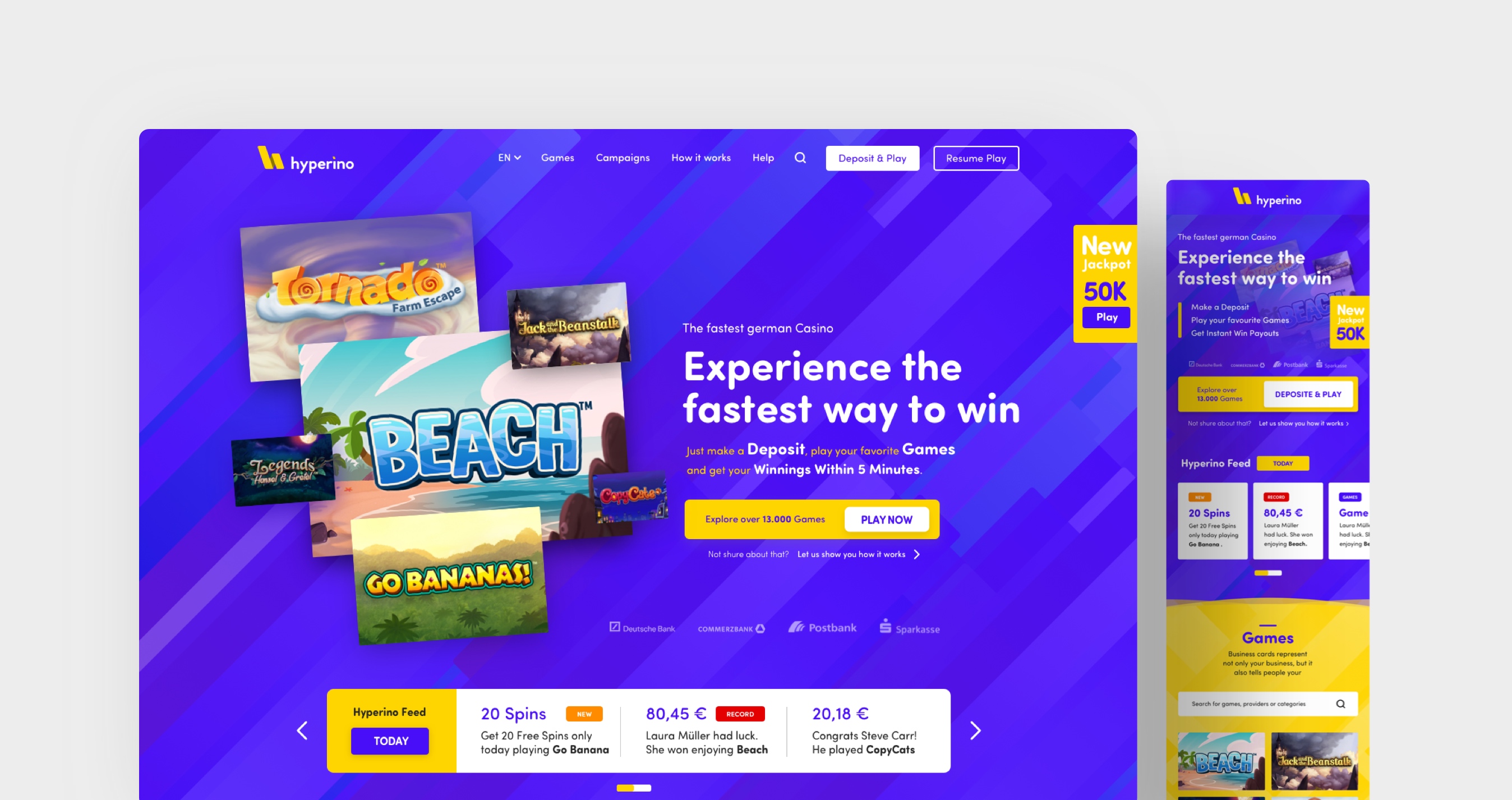
From other gaming websites' research data, we knew that users like to choose to decide to play a game. We focused on big game thumbnails with bright colours and a centred search bar.
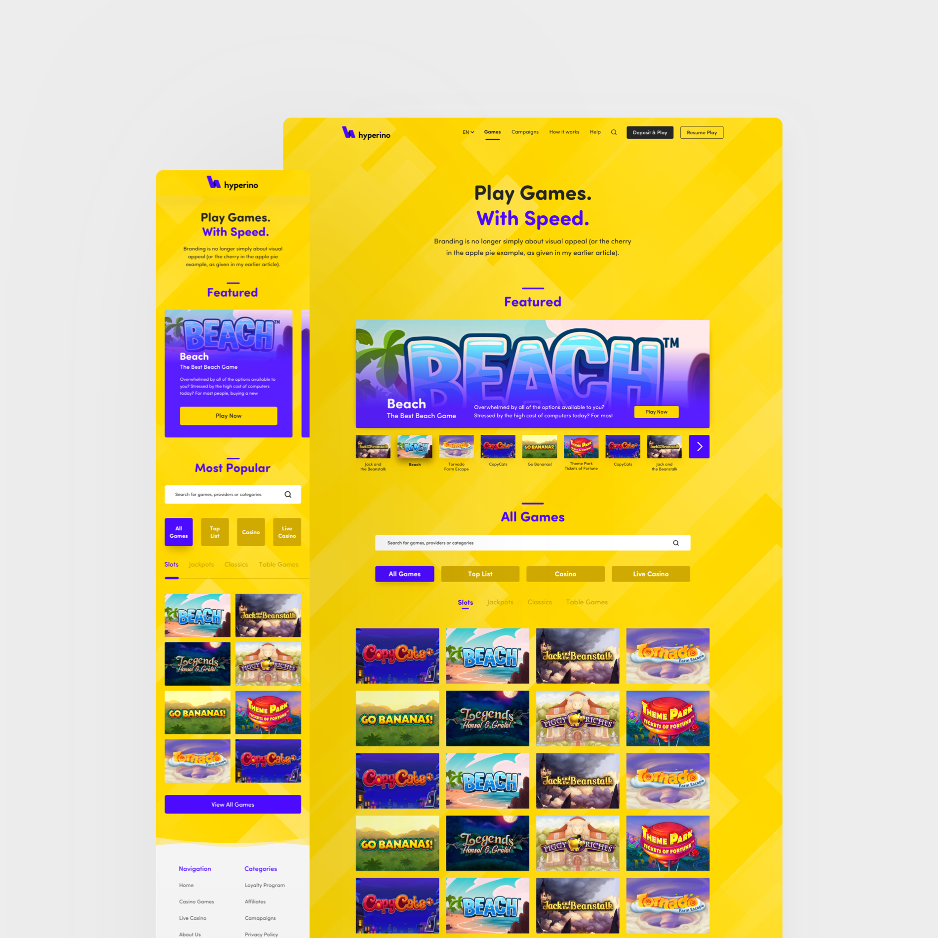
Games page with clean structure,
inviting to scroll and big game tiles.
We let the user perceive every section by theming it with another primary colour to ensure continued interaction. A recurrent element throughout is the "bar" background as header and footer element on every page.
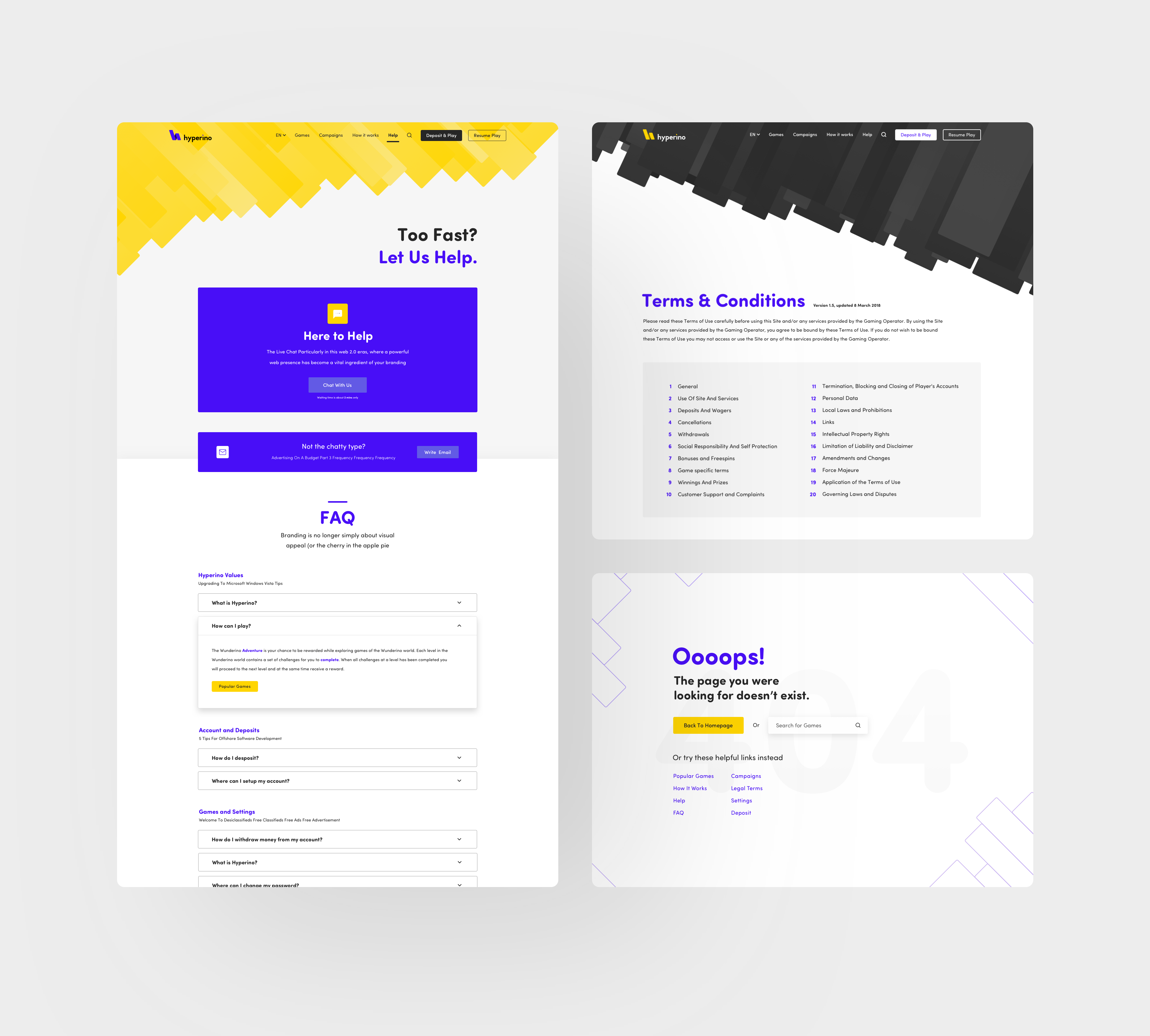
Different colour themed pattern backgrounds. Left: Help page with FAQ, Top right; Terms and Conditions, Bottom right Error page.
The visual approach was to stand out with a very own brand personality.
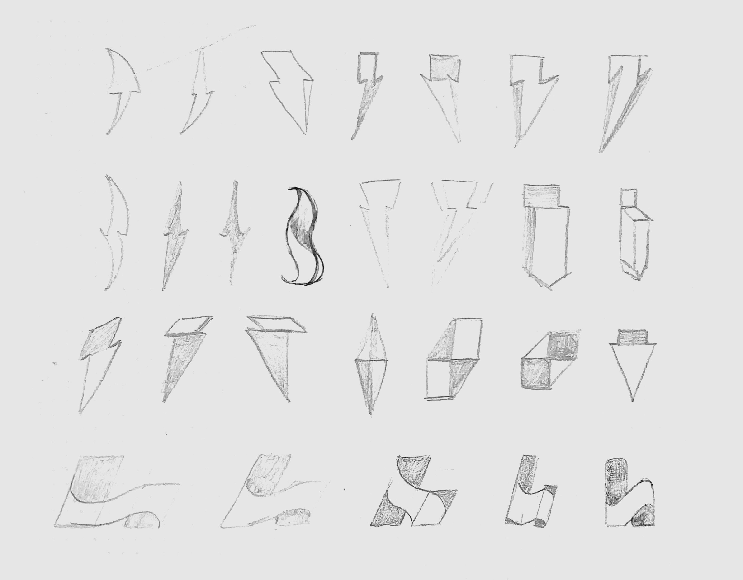
Early logo sketches. Transitions from
lightning shapes to letter H.
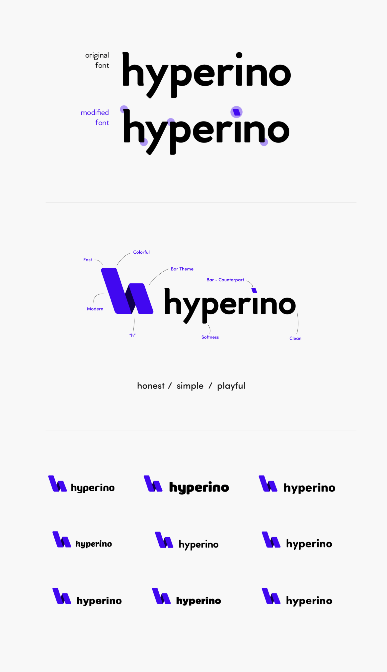
Wordmark: I modified the original typeface
Venci CF to get coherent brand characteristics.
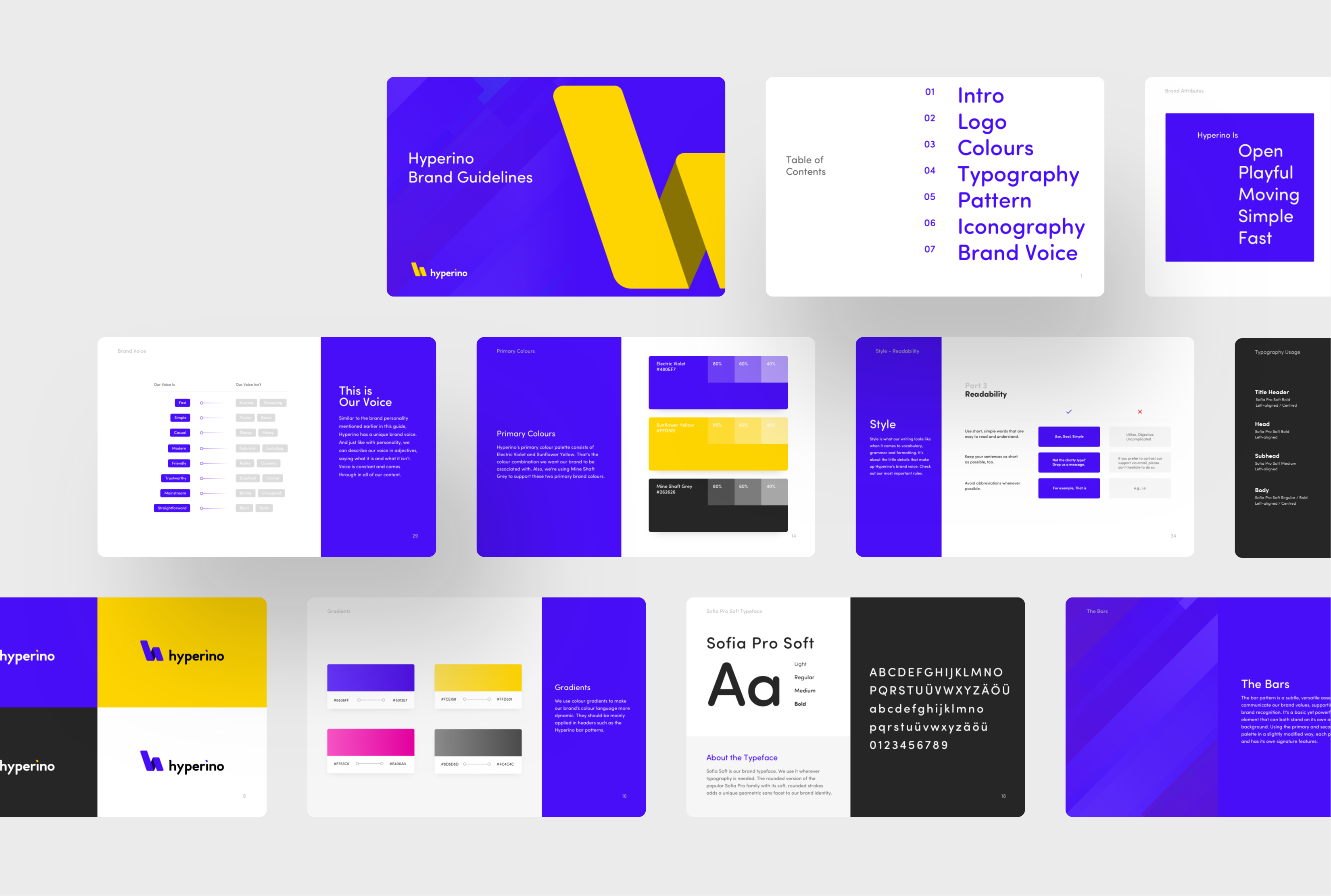
Brandbook as final brand part to
structure and test the brands' principles.
Project